Although we love QGIS we prefer programmatic solutions when we have to visualize data. The Python ecosystem offers excellent tools to produce interactive and static maps. We tested Altair and Folium on the same dataset.
(more…)Category: visualization
-
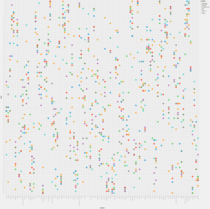
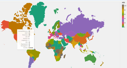
Which country is the best? Punch card version
-
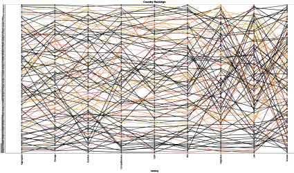
Which country is the best? The top 10 on bump charts
The most-read post of all time on our blog is Which country is the best? Dealing with ranking data. The data took on a new look with bump charts.
(more…) -

The urban geography of inequalities
A few weeks ago we had a heatwave and we were thinking if the hotter a place the poorer it is. We could collect data to test our hypothesis thanks to the recent advances in open data and scraping technologies.
(more…) -
GDELT – the best source for news addicts
We love reading news but who’s got the time to read ALL articles? Luckily, the Global Database of Events, Language, and Tone, GDELT for short, scrapes tons of news articles and other sources of information. And yes, you can access their data via an API or very convenient Python and R SDKs.
(more…)